I cloned the live site before I touched it
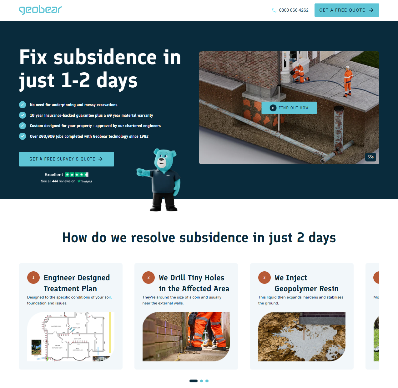
Geobear runs a HubSpot CMS estate of 50+ pages across several brand variants, all powered by the same theme. The brief was a new residential landing page: different layout, different modules, faster to ship. I cloned the live theme into a parallel build, so anything I broke stayed on the landing page. Nine custom modules from scratch: sticky nav, hero with background video, case carousel, get-advice flow, logos, testimonials, video gallery, CTA banner, and a Leadoo form wrapper.
Cloning the theme first
Before writing a single line of HubL, I pulled a local copy of the live theme with
hs cms fetch, renamed the folder to geobear-lp, updated
theme.json, and pushed it back as a parallel theme via hs cms upload.
The original was never touched. Anything I broke on the landing page stayed on the landing page.
The 50+ pages on the live theme were never at risk.
That setup took about five minutes. I do it on every CMS project because the alternative, discovering mid-build that a change cascaded somewhere unexpected, is a much worse five minutes.
Module structure
Every custom module ships with the same folder structure:
hero/
├── fields.json    # editor schema: every editable field
├── module.html    # HubL template
├── module.css     # scoped styles
├── module.js      # interaction logic (where needed)
└── meta.json      # registers the module with HubSpot's editor
fields.json is where most of the real design work happens. It defines every field
a content editor can change: text, images, colours, booleans, field groups, rich text. A
well-built schema means the editor UI works the way the person using it expects. Get it wrong
and every content update becomes a conversation.
One thing worth knowing about meta.json: you need both
host_template_types and content_types set, or the module silently
doesn't show up in HubSpot's landing-page picker. Nothing in the UI tells you why. I found it
by diffing a working module against a broken one field by field.
For Geobear I built nine modules from scratch: sticky navigation, hero (background video, bullets, Trustpilot widget, mascot illustration), a four-step case carousel, a get-advice flow, featured logos, testimonials, a video gallery, a CTA banner, and a form module wrapping a Leadoo embed. Different requirements, same folder structure, same handover standard.
JavaScript: keep it centralised
One listener for all smooth-scroll CTAs
The navigation module handles all smooth-scroll CTAs through a single event-delegated click
listener. Every CTA button anywhere on the page carries a data-scroll-target
attribute. The nav catches everything from one place:
document.addEventListener('click', (e) => {
  const trigger = e.target.closest('[data-scroll-target]');
  if (!trigger) return;

  const reduceMotion = window.matchMedia('(prefers-reduced-motion: reduce)').matches;
  const target = document.querySelector(trigger.dataset.scrollTarget);
  if (!target) return;

  reduceMotion
    ? target.scrollIntoView({ block: 'start' })
    : target.scrollIntoView({ behavior: 'smooth', block: 'start' });
});
One listener, seven modules with CTA buttons. The prefers-reduced-motion check
means users who've set that preference in their OS get instant scroll, not a fallback, the
correct behaviour for them.
Fixing sticky nav in HubSpot's drag-and-drop sections
position: sticky silently fails when a parent element has
overflow: hidden, which HubSpot's drag-and-drop section wrappers add by default.
I switched to position: fixed and wrote a ResizeObserver shim that
keeps body padding in sync with the nav's actual rendered height:
const nav = document.querySelector('.lp-nav');
const syncPadding = () => {
  document.body.style.paddingTop = `${nav.offsetHeight}px`;
};

syncPadding();
new ResizeObserver(syncPadding).observe(nav);
Nav height changes across breakpoints. A hardcoded pixel value would need separate media queries to stay accurate. The observer watches and updates: nothing else to maintain.
Deferred Swiper initialisation
The carousels use Swiper.js, but initialisation is deferred until each carousel is near the viewport. Swiper's bundle is ~50KB. Parsing it before the user has scrolled anywhere shows up in Total Blocking Time:
const observer = new IntersectionObserver((entries) => {
  entries.forEach(({ isIntersecting, target }) => {
    if (!isIntersecting) return;
    new Swiper(target, {
      slidesPerView: 1,
      loop: true,
      speed: window.matchMedia('(prefers-reduced-motion: reduce)').matches ? 0 : 400,
    });
    observer.unobserve(target);
  });
}, { rootMargin: '200px' });

document.querySelectorAll('.swiper').forEach((el) => observer.observe(el));
rootMargin: '200px' triggers Swiper before the carousel enters the viewport,
so there's no visible pop-in. speed: 0 for reduced-motion users means the
carousel still works: it just cuts instead of animating.
CSS: design system before anything else
Geobear's brand spec came through Figma: Finlandica for headings, Funnel Sans for body,
#5FC5D6 primary cyan, #092B3C navy, 1.6px letter-spacing on
uppercase buttons. That all went into CSS custom properties at the theme level before any
module styles were written:
:root {
  --color-primary: #5FC5D6;
  --color-text: #092B3C;
  --font-heading: 'Finlandica', sans-serif;
  --font-body: 'Funnel Sans', sans-serif;
  --tracking-button: 1.6px;
}
Partway through the project the palette changed from orange to cyan. One file, one pass. That's only a realistic outcome if everything references variables from the start rather than hardcoded values scattered across nine stylesheets.
Responsive layout without JS
The advice section is a Swiper carousel on mobile and a three-column grid on desktop, and the switch happens entirely in CSS:
.advice-grid {
  display: flex; /* Swiper owns layout on mobile */
}

@media (min-width: 1024px) {
  .advice-grid {
    display: grid;
    grid-template-columns: repeat(3, 1fr);
    gap: var(--space-6);
  }
}
No JS toggling classes, no viewport detection. Swiper initialises on mobile, CSS grid takes over above the breakpoint, and both coexist without interfering.
:focus-visible instead of :focus
Interactive elements use :focus-visible rather than :focus. The
practical difference: :focus rings appear on mouse clicks too, which looks bad
enough that most developers disable them entirely. :focus-visible only renders
when the browser detects keyboard navigation is active, so keyboard users get clear indicators
and mouse users don't see anything.
Reduced-motion block on every module
@media (prefers-reduced-motion: reduce) {
  *, *::before, *::after {
    animation-duration: 0.01ms !important;
    transition-duration: 0.01ms !important;
  }
}
Performance details
Hero images get fetchpriority="high" in the HubL template. Below-fold images
get fetchpriority="low" loading="lazy" decoding="async". Every
<img> has explicit width and height. Without
those the browser can't reserve layout space before the image loads, and the shifts
accumulate in CLS.
The logo and phone icon in the nav ship as inline SVGs. No extra network request, no race condition, and the design renders correctly on the first paint.
Schema.org JSON-LD
Schema markup is inline in the relevant modules: HowTo on the step carousels,
ItemList of VideoObject on the gallery,
Review on the featured testimonial. All three pass Google's Rich Results Test.
That markup has to be written directly into the module template using HubL to pull the actual
field values. A theme or plugin can't generate it for you.